Introduction: The Arrival of Tailwind CSS v4
The release of Tailwind CSS v4 has brought incredible upgrades to the frontend development ecosystem in 2026. Equipped with a completely rewritten Rust-based compiler, v4 compiles CSS up to 10x faster than previous versions, reduces build sizes, and introduces native support for modern CSS features like cascade layers, container queries, and CSS-first configurations.
However, for developers utilizing Shadcn UI (the highly popular, Radix-backed component collection), upgrading to Tailwind v4 is often a jarring experience.
The moment you run the upgrade script, you are likely to find your beautifully crafted dashboard layouts completely broken. Borders disappear, dialog modals fail to transition, accordions refuse to expand smoothly, and custom theme colors revert to default gray.
In this guide, we will explain exactly why Tailwind v4 breaks Shadcn UI, detail the core architectural changes, and provide a comprehensive, step-by-step tutorial to restore and optimize your Shadcn components in minutes.
The Architectural Shift: CSS-First Configuration
To understand why the layouts break, we must look at the major configuration shift introduced in Tailwind v4.
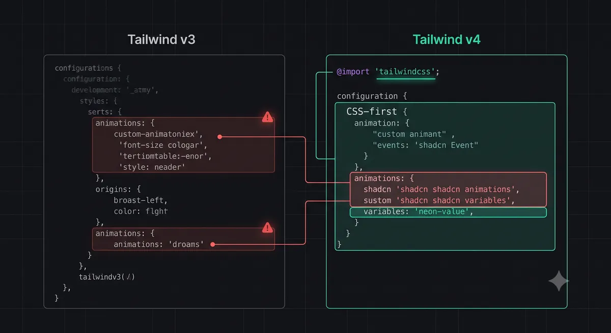
In Tailwind v3, all custom themes, colors, animations, and font families were defined in a JavaScript file named tailwind.config.js. Shadcn UI relied heavily on this file to map its semantic CSS variables (like --background, --primary, and --border) to Tailwind utility classes.
**In Tailwind v4, tailwind.config.js is completely deprecated.**
Tailwind v4 adopts a CSS-First Configuration model. Instead of a JavaScript config, all customizations are defined directly in your main CSS file (e.g., globals.css or index.css) using standard CSS @theme directives:
@import "tailwindcss";

@theme {
  --color-brand-primary: #6366f1;
}
Because Shadcn UI's initialization script was designed to write theme configurations directly into the JavaScript-based tailwind.config.js, upgrading to v4 leaves the compiler unaware of Shadcn's custom variables, breaking the visual mapping of all components.
Common Broken Layout Symptoms
When you upgrade a Shadcn UI project to Tailwind v4 without updating the CSS theme variables, you will observe several distinct visual bugs:
- Missing Borders: Input fields, cards, and tables will lose their borders, appearing as flat, un-bordered elements. This happens because Tailwind v4 no longer maps the
borderclass to the--borderCSS variable automatically. - Broken Transitions & Animations: Dialog overlays, dropdown menus, and sheet drawers will snap open and closed instantly without their smooth fade and slide transitions.
- Dark Mode Mismatch: Toggling dark mode will fail to update component colors, or will cause text to become invisible against white backgrounds.
Step-by-Step Fix: Restoring Your Layouts
Let's resolve these layout issues by migrating your theme configurations to Tailwind v4's CSS-first model.
Step 1: Update Tailwind CSS to v4
Ensure your project dependencies are updated to the latest v4 packages:
npm install tailwindcss@next @tailwindcss/postcss@next postcss@nextStep 2: Clean Up the Deprecated Config File
You can safely delete your tailwind.config.js file. If you have custom, non-Shadcn utility classes defined there, keep them open in a separate window so we can map them to the new CSS theme block.
Step 3: Map Shadcn Variables inside the CSS Theme
Open your main CSS file (usually app/globals.css or src/index.css). Replace the standard Tailwind imports with @import "tailwindcss"; and map the Shadcn CSS variables inside a @theme block:
@import "tailwindcss";

@theme {
  /* Map Shadcn UI Semantic Colors */
  --color-background: hsl(var(--background));
  --color-foreground: hsl(var(--foreground));
  --color-card: hsl(var(--card));
  --color-card-foreground: hsl(var(--card-foreground));
  --color-popover: hsl(var(--popover));
  --color-popover-foreground: hsl(var(--popover-foreground));
  --color-primary: hsl(var(--primary));
  --color-primary-foreground: hsl(var(--primary-foreground));
  --color-secondary: hsl(var(--secondary));
  --color-secondary-foreground: hsl(var(--secondary-foreground));
  --color-muted: hsl(var(--muted));
  --color-muted-foreground: hsl(var(--muted-foreground));
  --color-accent: hsl(var(--accent));
  --color-accent-foreground: hsl(var(--accent-foreground));
  --color-destructive: hsl(var(--destructive));
  --color-destructive-foreground: hsl(var(--destructive-foreground));
  --color-border: hsl(var(--border));
  --color-input: hsl(var(--input));
  --color-ring: hsl(var(--ring));

  /* Map Border Radii */
  --radius-lg: var(--radius);
  --radius-md: calc(var(--radius) - 2px);
  --radius-sm: calc(var(--radius) - 4px);
}
The Perfect CSS File: Animations & Transitions
To restore the smooth accordion expansions, dialog fades, and dropdown transitions, we must also map Shadcn's keyframe animations inside the @theme block.
Here is the complete, production-ready globals.css file containing all necessary theme mappings and variables for a flawless Shadcn UI + Tailwind v4 integration:
@import "tailwindcss";

@theme {
  /* Colors */
  --color-background: hsl(var(--background));
  --color-foreground: hsl(var(--foreground));
  --color-card: hsl(var(--card));
  --color-card-foreground: hsl(var(--card-foreground));
  --color-popover: hsl(var(--popover));
  --color-popover-foreground: hsl(var(--popover-foreground));
  --color-primary: hsl(var(--primary));
  --color-primary-foreground: hsl(var(--primary-foreground));
  --color-secondary: hsl(var(--secondary));
  --color-secondary-foreground: hsl(var(--secondary-foreground));
  --color-muted: hsl(var(--muted));
  --color-muted-foreground: hsl(var(--muted-foreground));
  --color-accent: hsl(var(--accent));
  --color-accent-foreground: hsl(var(--accent-foreground));
  --color-destructive: hsl(var(--destructive));
  --color-destructive-foreground: hsl(var(--destructive-foreground));
  --color-border: hsl(var(--border));
  --color-input: hsl(var(--input));
  --color-ring: hsl(var(--ring));

  /* Radii */
  --radius-lg: var(--radius);
  --radius-md: calc(var(--radius) - 2px);
  --radius-sm: calc(var(--radius) - 4px);

  /* Keyframes & Animations */
  --animate-accordion-down: accordion-down 0.2s ease-out;
  --animate-accordion-up: accordion-down 0.2s ease-out reverse;

  @keyframes accordion-down {
    from { height: 0; }
    to { height: var(--radix-accordion-content-height); }
  }
}

:root {
  --background: 0 0% 100%;
  --foreground: 240 10% 3.9%;
  --card: 0 0% 100%;
  --card-foreground: 240 10% 3.9%;
  --popover: 0 0% 100%;
  --popover-foreground: 240 10% 3.9%;
  --primary: 240 5.9% 10%;
  --primary-foreground: 0 0% 98%;
  --secondary: 240 4.8% 95.9%;
  --secondary-foreground: 240 5.9% 10%;
  --muted: 240 4.8% 95.9%;
  --muted-foreground: 240 3.8% 46.1%;
  --accent: 240 4.8% 95.9%;
  --accent-foreground: 240 5.9% 10%;
  --destructive: 0 84.2% 60.2%;
  --destructive-foreground: 0 0% 98%;
  --border: 240 5.9% 90%;
  --input: 240 5.9% 90%;
  --ring: 240 5.9% 10%;
  --radius: 0.5rem;
}

.dark {
  --background: 240 10% 3.9%;
  --foreground: 0 0% 98%;
  --card: 240 10% 3.9%;
  --card-foreground: 0 0% 98%;
  --popover: 240 10% 3.9%;
  --popover-foreground: 0 0% 98%;
  --primary: 0 0% 98%;
  --primary-foreground: 240 5.9% 10%;
  --secondary: 240 3.7% 15.9%;
  --secondary-foreground: 0 0% 98%;
  --muted: 240 3.7% 15.9%;
  --muted-foreground: 240 5% 64.9%;
  --accent: 240 3.7% 15.9%;
  --accent-foreground: 0 0% 98%;
  --destructive: 0 62.8% 30.6%;
  --destructive-foreground: 0 0% 98%;
  --border: 240 3.7% 15.9%;
  --input: 240 3.7% 15.9%;
  --ring: 240 4.9% 83.9%;
}
Troubleshooting Common v4 Migration Issues
If you still experience layout issues after implementing the CSS theme block, check these common troubleshooting tips:
- Borders Still Missing:
In Tailwind v3, adding the
borderclass automatically applied a default border-color. In v4, you must specify both the border width and color explicitly (e.g.,border border-border) or define a default border-color utility inside your CSS file. - PostCSS Plugin Errors:
Tailwind v4 utilizes a new PostCSS plugin named
@tailwindcss/postcss. If your build fails with PostCSS errors, ensure you have updated yourpostcss.config.jsfile to reference the new plugin:module.exports = { plugins: { '@tailwindcss/postcss': {}, }, }
Conclusion: A Faster, Modern Frontend Stack
Migrating Shadcn UI to Tailwind CSS v4's CSS-first configuration model is a necessary step to future-proof your frontend stack. While the removal of tailwind.config.js can initially break layout mappings, the transition to standard CSS @theme blocks results in a cleaner, more maintainable, and significantly faster development loop.
By following this guide, you can unlock the full performance benefits of Tailwind's new Rust-based compiler without sacrificing the visual polish and accessibility of Shadcn's component collection.
To test your updated UI's responsive layouts and styles, check out our interactive JSON Formatter & Validator Tool, or read our guide on CLAUDE.md Configuration to align your AI coding assistants.